
We have a love/hate relationship with tables. On the one hand, tables organize information, especially when you need to make a side-by-side comparison or display data. On the other hand, it’s easy to get a little table-slap-happy, creating a choppy document that is difficult to view or read and is especially difficult for a screen reader. And let’s not even talk about the potential accessibility nightmare.
A table is a good option if you need to display dates, lists, or side-by-side information. Tables help us avoid using the Tab button, which can cause screen reader navigation problems. However, too much information or too many columns and rows are difficult to view and read in a table. So, it is best to revise your content or find a way to avoid using a table.
There are times when a table is the cleanest way to present the information, but a poorly formatted table is also difficult to distinguish visually. So, let me share some best practices for formatting tables in eLearning.
Accessibility and Tables
Screen readers have a difficult time reading tables. A screen reader will read a table left to right, top to bottom. It seems simple, but let’s look at some common examples of tables in eLearning and why, without proper formatting, they can have problems.

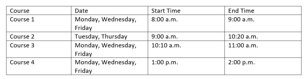
Screen reader reads Table 1: Course, date, start time, end time, course 1, Monday, Wednesday, Friday, 8:00 a.m., 9:00 a.m., course 2, Tuesday, Thursday, 9:00 a.m., 10:20 a.m. …etc.
That doesn’t seem to make much sense, does it?

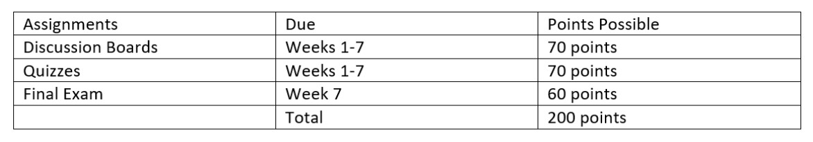
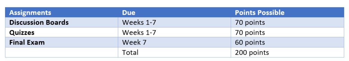
Screen reader reads Table 2: Assignments, due, points possible, discussion boards, Weeks 1-7, 70 points, quizzes, Weeks 1-7, 70 points …etc.
This table’s just as bad. Not only are these tables difficult to see visually, they are also difficult to hear through a screen reader.
Now, let’s take a look at each of these tables properly formatted and using best practices for accessibility including distinguishing a header row, first column, and total row. We’ll also explore how to adjust the color, spacing, and add alt text.
Let’s take another look at that first table:
Now, here is the revised version.
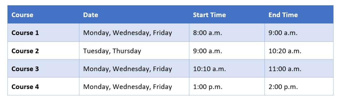
We have a clear Header Row and First Column. This formatting helps a screen reader know to read the Header Row before each row.
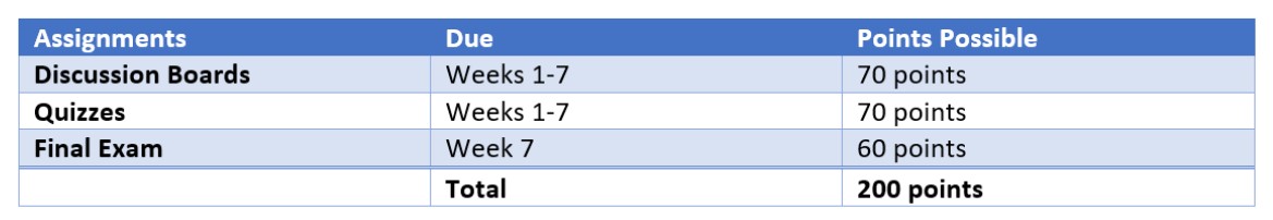
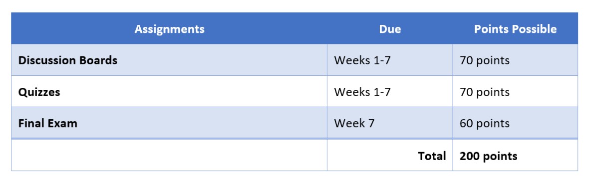
Let’s take a look at that second table.
And, here is the revised version.
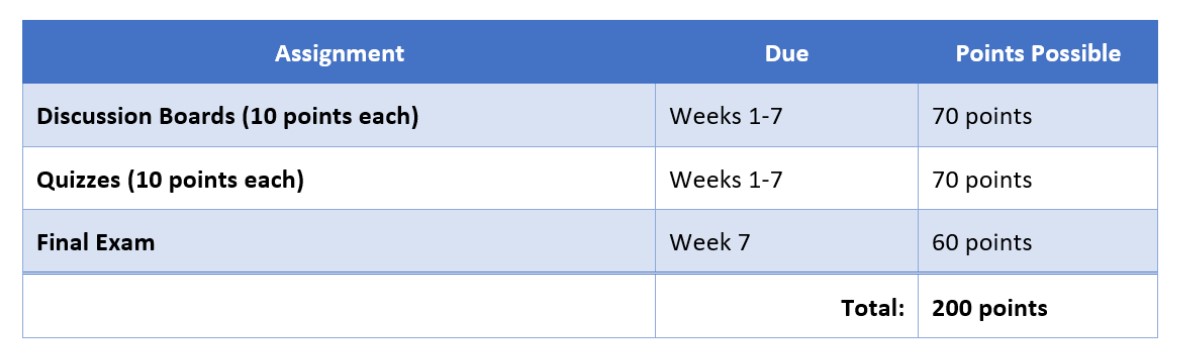
This table also has a clear Header Row and First Column. But, we also added a Total Row.
As you see, even a few tweaks improve your tables. Let’s explore a few more ways to correctly format your table and use best practices for accessibility including Alt Text, which we will explore below.
Let’s walk through how I formatted one of the tables above.
I’ll be covering how to create tables in MS Word—if your tables live on a webpage, here’s a great resource for creating web-accessible tables from WebAIM.
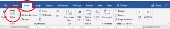
First, we need to create a table using the built-in MS Word Table feature in the Insert tab.
Then, populate the table.

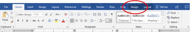
To format your table, you’ll work in the Design tab. This tab automatically appears when you are in your table. If you lose it, just click anywhere in your table and it should appear again.
Once you click on the Design tab, you’ll see many options; it can be overwhelming. So, we’re going to stick with some simple functions.
For the table above, I’ll first select a visual style.
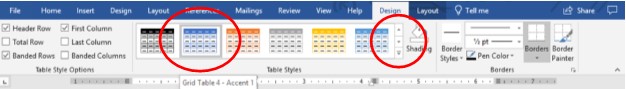
A blue tone is a great option for accessibility.
Great! That change alone made the table easier to read.
Now, we want to format a couple more features to help make this table accessible to screen readers.
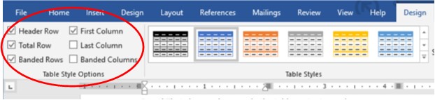
For this table, I need a Header Row, Banded Rows, First Column, and I’ll need a Total Row. So, I’ve selected those options.
Finally, this table is a little squished and could use just a bit more tweaking. Let’s look at a couple more ways to clean it up.
I want to adjust the tabs and the alignment in the Header Row and Total.
Now, I want to adjust the spacing.
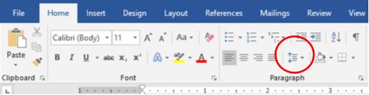
To adjust the spacing in your table, my preferred method is to use the Paragraph button. This keeps a consistent format and spacing throughout your table.
Select or highlight the whole table.
Your Paragraph button is in the Home tab. You can also find it with a right-click (PC) or CMD + Click (Mac) on your table.
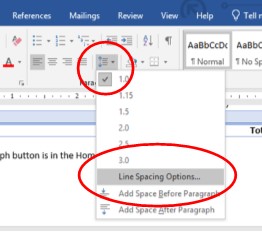
Select Line Spacing Options…
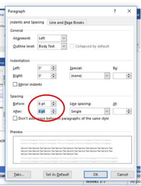
MS Word uses 12 pt as the default size and spacing. For a table, I like to use half of that size (6 pt) before and after the text in a table.
Let’s see how that changes the table style.
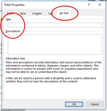
To add Alt Text, Right-click (PC) or CMD + Click (Mac) on your table, and select Table Properties.
Adding Alt-Text to Tables
The last thing we’re going to do is add Alternative Text, or Alt Text. Alt Text describes the table for a screen reader, which improves the accessibility.

Select the Alt Text tab
With that, our table is done! It may seem complicated at first, but using these best practices for table design and formatting will help you create tables that are easier to read and more accessible.
Have you been able to organize your documents using Tables? Let us know below!
References
Oregon State University. (n.d.). Tables. Retrieved from https://accessibility.oregonstate.edu/tables
Microsoft. (n.d.). Add alternative text to a shape, picture, chart, SmartArt graphic, or other object. Retrieved from https://support.office.com/en-us/article/add-alternative-text-to-a-shape-picture-chart-smartart-graphic-or-other-object-44989b2a-903c-4d9a-b742-6a75b451c669
University of Colorado Boulder. (2016). When to use tables and how to make them accessible to screen reader users. Retrieved from https://www.colorado.edu/accessibility/2016/09/17/when-use-tables-and-how-make-them-accessible-screen-reader-users
WebAIM. (n.d.). Creating accessible tables. Retrieved from https://webaim.org/techniques/tables/

3 thoughts on “Formatting eLearning Documents: Table That Thought”