
Over the summer, we updated our online general education syllabus template using learning theory, universal design for learning (UDL), plain writing, and accessibility principles. Recently, Dave, Tara, and I presented this process at the Symposium on Universal Design for Instruction and Learning.
As we heard from Tara in An Overview of Universal Design for Learning, UDL principles provide a framework that removes barriers to learning by helping us:
-
determine what’s essential to a course,
-
communicate clear expectations, and
-
create welcoming classrooms.
These same principles apply to your course, syllabus, and other materials. Let’s look at ways to infuse design and writing into the document and make it easier to use.
Who Are Your Learners?
 Designers and writers (hopefully) start with the adage “know your audience.” User experience design often starts with personas, or user profiles, to help the designer focus on abilities, motivations, and goals.
But the average learner is a myth.
This doesn’t mean that personas aren’t helpful. While personas allow us to focus our design, they don’t give us the full picture.
We need to be aware that learners come from a spectrum of physical, mental, and emotional capabilities. Our learners juggle work, health, family, friends, and all sorts of obligations on top of your course.
That’s a lot of strain on their cognitive load! That’s why we need to remove anything that distracts from learning.
What Message Does Your Syllabus Send to the Learner?
An ideal syllabus is a map—a clear tool for guiding students to be successful in the course. Elearning expert Patty Shank says that every component on the page is part of a message we are trying to send (Shank, 2017, p. 87).
If we’re sending a message to learners, why do we include dense blocks of text, complex writing, unclear instructions, and, let’s be honest, too much information?
Shank (2017) describes learnability as “the ease and speed with which something can be learned, applied, and remembered” (p. 9). Clean design and plain writing provide distraction-free learning to all learners, including those with attention, comprehension, memory, problem-solving, and emotional issues.
If you’re of a certain age, you probably remember how hard it used to be to drive someplace new. Giant US atlas in the back seat. Three or four state maps floating around the car (unfolded, of course—it was impossible to origami them back into shape). Stopping at gas stations to make sure you were still on the right course.
MapQuest made it a little easier. You’d print four or five pages of step-by-step directions—the front passenger became the navigator and interpreter of turns.
These days, it’s easy to travel with GPS and smartphones. We get instructions when we need them—no more memorizing dozens of turns—and we’re rerouted when something’s in our way.
When you use clean design and plain writing in your syllabus, you enable this type of distraction-free learning.
Content Organization and Design
I’ve shared tips for curating course materials before. It’s important to organize your syllabus content using only the most relevant information to ease strain on cognitive load.
Curate Your Content
 Sort your content into two piles: need to know and nice to know. If your student needs the information to understand expectations and instructions, include it in your syllabus. If you’ve included instructions that overcomplicate your expectations or a reading that doesn’t directly apply to an assignment, remove it.
Nice to know information might not belong in your syllabus, but it’s great for helping students in their moment of need. For example, a video that clarifies a concept might be shared with a student that needs extra help or an article might encourage the student that found a spark of interest about a topic.
Chunk Content Into Logical Organization
If you see an article or website that goes on and on, you probably won’t finish it (I know I don’t). Yet if you break up that same content into smaller bits of information with plenty of white space to help it breathe—it’s not so bad.
Research shows that you can decrease cognitive load by removing visual clutter, building a familiar structure, and offloading tasks (Minimize Cognitive Load, Nielson Norman Group).
We call this chunking. A few things help you do this:
- Sentences should be around 20 words and cover a single idea.
-
Paragraphs should be no more than five sentences and focus on a single topic.
-
Describe the section’s subject with descriptive headings.
-
Enhance the text’s meaning with relevant images.
-
Use bullet to highlight key information and number lists to show a process.
As you chunk your syllabus, you want to consider logical organization. Journalists use the inverted triangle method to frontload the most important information at the top of an article before they move to less important information. It allows us to learn the facts even if we don’t finish reading. This might be useful for your assignment descriptions.
Some other ways to logically organize information include top to bottom, left to right, A to Z, and first to last. Whatever you choose, just keep it consistent for the learner.
Design for Reading
So why do we chunk materials? Familiar structures offload the task of learning something not relevant to the topic—it means we don’t have to think about it.
In the West, reading has a certain hierarchy. We scan documents, especially on a screen, using trackable eye movements.
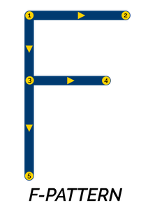
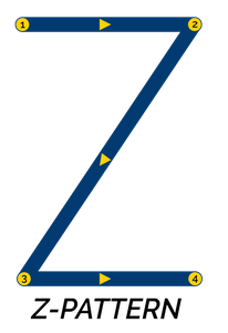
We read using a combination of the F-pattern and Z-Pattern. In both reading patterns, we start on the top of the page and skim from left to right. Then we scan down and across the page for white space, headings, links, lists, or anything that tells us to stop (F-shaped pattern for reading web content, Nielsen Norman Group).
Plain Writing
Now that we’ve looked at design, let’s move to plain writing. Our old syllabus template included a lot of academic writing, which uses long, complex sentences meant to show off knowledge. This isn’t really a good map for our learners.
Some experts worry that plain writing “dumbs down” the material. Really, plain writing communicates a process or helps solve a problem. Since plain writing starts with the audience in mind, it focuses on being clear, concise, and consistent throughout the document. It uses simple words and tone, and uses design and accessibility principles to remove barriers from learning.
“Professionals want clear, concise information devoid of unnecessary jargon or complex terms.” (Nielsen Norman Group, 2017)
And yes, studies show that even experts prefer plain language.
Active voice and removing meaningless words make your writing more clear and concise.
Active Voice
I’ve already shared how to improve your course content with active voice. So, to recap, active voice has to do with what’s being acted upon.
Think of it this way: Active voice snaps with energy. My verb, snaps, got your attention.
Now let’s try “Yawning is caused by passive voice.” That sentence bores me (and it’s a mouthful). Now think about how your learner feels!
Your learner needs to reconstruct the sentence in his or her mind to understand it—let’s remove the extra work.
Now, if you weren’t a glorified English major (like myself) you might struggle to find passive voice. Grammarly shared a great tip to find passive voice:
- Find the verb.
- Add “by zombies” after it.
- If the sentence makes sense, fix it.
This doesn’t work all of the time, but it’s a good place to start.
Omit Meaningless Words and Phrases
You can make your syllabus more concise by removing meaningless words and phrases. Look for ways to say it in fewer words or with a better word. If you use the phrase “what I mean to say,” you should take it out and say what you mean.
If you need help finding words or phrases that don’t add meaning, ask yourself the following:
- Does the word or phrase add meaning?
-
Did you use a lot of adverbs?
-
Is there a better word?
-
Can you say it in fewer words?
Readability Statistics
Okay, you want to know if your syllabus is easy to read. After you run the Spelling & Grammar tool in Microsoft Word, you see readability statistics.
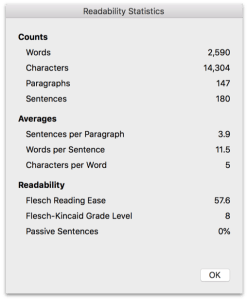
The Flesch Reading Ease rates on a 100-point scale. Higher numbers are easier to read, but you want to shoot for 60-70. Flesch-Kinkaid Reading Level is based on U.S. school grade levels, a 9th grade improves understandability.
Plain Writing Act of 2010
And, if I haven’t convinced you of the importance of good design and plain writing, a law passed in 2010 to use design and plain writing improve US government communications. The government adopted writing standards to remove jargon, euphemism, and abstractions from government documents. Government sites even get a report card for it.
While this law doesn’t apply to course syllabi, it’s a great model. You can find more tips on PlainLanguage.gov.
The Design of Writing
You can’t write without design, and you can’t design without content. Most importantly, you need to start with what you have, ask for feedback from your students, and remember that both design and writing are iterative processes.
For me, the design of writing is poetry. You refine information to its essence—and deliver it in a way that’s meaningful to the reader. In future posts, I’ll explore these ideas deeper.
Is design and plain writing your passion? How do you reduce barriers in your course documents? Join the conversation here and on Twitter.
References
Loranger, H. (2017, October 8). Plain language is for everyone, even experts. Retrieved from https://www.nngroup.com/articles/plain-language-experts/
Joki, K. (2017, October 12). A scary-easy way to help you find passive voice! Retrieved from https://www.grammarly.com/blog/a-scary-easy-way-to-help-you-find-passive-voice/
Pernice, K. (2017, November 12). F-shaped pattern of reading on the web: Misunderstood, but still relevant (even on mobile). Retrieved from https://www.nngroup.com/articles/f-shaped-pattern-reading-web-content/
Shank, P. (2017). Write and organize for deeper learning: 28 evidence-based and easy-to-apply tactics that will make your instruction better for learning. Create Space Independent Publishing Platform.
Whitenton, K. (2013, December 22). Minimize cognitive load to maximize usability. Retrieved from https://www.nngroup.com/articles/minimize-cognitive-load/

9 thoughts on “Remove Barriers to Learning with Design and Plain Writing”